
You’ve got two boxes sitting side by side. One of them is taller than the other, so the shorter one has this awkward gap of whitespace at the bottom. You try float, you try display: inline-block, you try vertical-align, and somehow the layout still looks like it was assembled by someone who has never seen a webpage before.
If that sounds familiar, you’re not bad at CSS. You just haven’t fully leaned on Flexbox yet.
Flexbox — short for the CSS Flexible Box Layout Module — is the tool that was built specifically to solve this class of problem: aligning items, distributing space, and handling layouts where you don’t know the exact size of every element ahead of time. Once it clicks, you stop reaching for hacks and start reaching for two or three properties that just work.
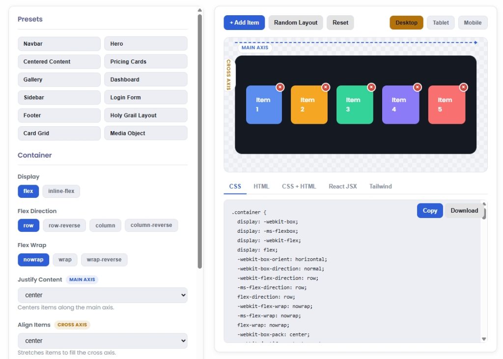
This guide walks through everything Flexbox does, in the order you’ll actually use it, and ends with a few copy-paste layout patterns you’ll probably use this week. If you’d rather skip the property-by-property memorization, our free CSS Flexbox Generator lets you build the layout visually and grab the CSS instantly — treat this article as the reference for what each setting actually does.
What Flexbox Actually Is
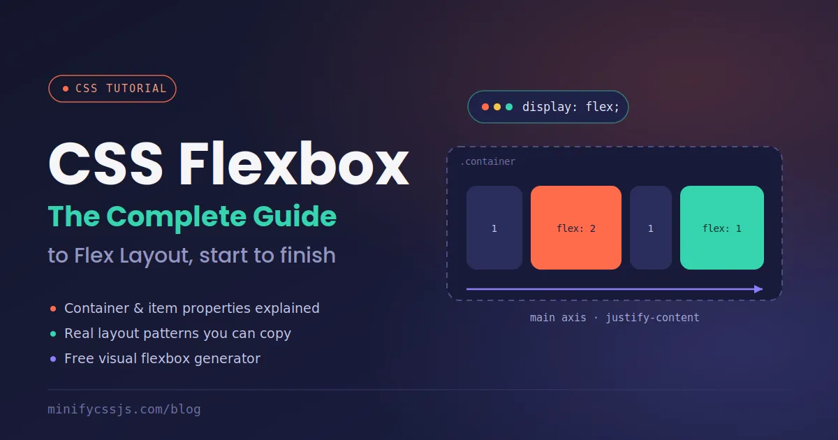
Flexbox is a one-dimensional layout model. That means it’s designed to arrange items along a single axis at a time — either in a row or in a column — and to control how those items grow, shrink, and align relative to each other and their container.
That’s the key mental model to hold onto: Flexbox thinks in terms of a main axis (the direction items flow) and a cross axis (perpendicular to that). Almost every Flexbox property is really just answering one of two questions: “how do items behave along the main axis?” or “how do they behave along the cross axis?”
To turn any element into a flex container, you need exactly one line:
.container {
display: flex;
}
That’s it. Every direct child of .container is now a “flex item,” and the layout engine takes over.
Flexbox Container Properties (Set on the Parent)
These properties go on the wrapping element — the one you gave display: flex to.
flex-direction
.container {
  flex-direction: row;            /* default: left to right */
  flex-direction: row-reverse;    /* right to left */
  flex-direction: column;         /* top to bottom */
  flex-direction: column-reverse; /* bottom to top */
}
Switching to column is how you build vertical stacks — sidebars, mobile nav menus, form layouts — without touching a single item’s CSS.
flex-wrap
By default, flex items try to squeeze onto a single line, shrinking as needed. flex-wrap: wrap lets them drop onto a new line instead once they run out of room, which is essential for responsive card grids and tag lists.
.container {
  flex-wrap: nowrap; /* default */
  flex-wrap: wrap;
  flex-wrap: wrap-reverse;
}
justify-content
Distributes space along the main axis. This is the one people reach for constantly, and also the one that gets confused with align-items.
.container {
  justify-content: flex-start;    /* default */
  justify-content: flex-end;
  justify-content: center;
  justify-content: space-between; /* even gaps between items, none at edges */
  justify-content: space-around;  /* even gaps, half-size at edges */
  justify-content: space-evenly;  /* fully even, including edges */
}
align-items
Distributes items along the cross axis — the opposite direction of justify-content. This is the single most common way to vertically center something in CSS.
.container {
  align-items: stretch;    /* default: items fill the cross axis */
  align-items: flex-start;
  align-items: flex-end;
  align-items: center;
  align-items: baseline;
}
The rule of thumb that saves everyone confusion: in a row layout, justify-content moves things left/right and align-items moves things up/down. Flip flex-direction to column, and those roles swap — because the main axis itself has rotated.
align-content
Only matters once you have wrapped, multi-line flex items. It controls the spacing between the lines themselves, not the items within a line — think of it as justify-content‘s cousin, but for the cross axis across multiple rows.
gap
The modern, clean way to add spacing between flex items without messing with margins on individual children.
.container {
  gap: 16px;          /* row and column gap, same value */
  gap: 16px 24px;      /* row-gap column-gap */
}
If you’re still using margin-right on every item except the last child to fake spacing, gap replaces that entirely — with far less specificity fighting.
flex-grow, flex-shrink, and flex-basis
These three are almost always written together as the flex shorthand, and they control how an item behaves when there’s extra space or not enough space.
.item {
  flex: 1 1 200px;
  /* flex-grow: 1     → take up available extra space */
  /* flex-shrink: 1   → allowed to shrink if space is tight */
  /* flex-basis: 200px → starting size before growing/shrinking */
}
A handful of shorthand values you’ll see constantly:
flex: 1— grow to fill available space equally with siblingsflex: 0 1 auto— the browser default; size based on content, don’t grow, can shrinkflex: none— fixed size, ignores available space entirely
align-self
Overrides align-items for one specific item, when you need a single card in a row to sit differently than the rest.
order
Changes the visual order of an item without touching your HTML source order — useful for reordering content on mobile versus desktop, though it should be used sparingly since it can hurt keyboard-navigation and screen-reader flow if the visual order and DOM order diverge too much.
Flexbox vs. CSS Grid: Which One Do You Need?
They’re not competitors — they solve different shaped problems.
- Flexbox is one-dimensional: use it when you’re arranging items in a single row or single column (navbars, button groups, card content alignment, form rows).
- CSS Grid is two-dimensional: use it when you need to control rows and columns simultaneously (full page layouts, image galleries, dashboards).
A common, very effective pattern is Grid for the overall page skeleton, and Flexbox for aligning content inside each grid cell.
Common Flexbox Mistakes to Watch For
- Setting
justify-contentwhen you meantalign-items. Remember: main axis vs. cross axis, and it flips withflex-direction. - Forgetting
flex-wrap: wrap. Without it, items will shrink indefinitely rather than drop to a new line, which is usually not what you want on smaller screens. - Using
flex-basisandwidthtogether and expectingwidthto win.flex-basistakes priority overwidthon the main axis when both are set. - Overusing
orderfor layout instead of usingflex-direction: row-reverse. If you’re just reversing a whole row, the direction property is simpler and doesn’t create a DOM/visual mismatch.
Browser Support
Flexbox has been fully supported in every major browser (Chrome, Firefox, Safari, Edge) for years at this point. The only real historical caveat is Internet Explorer, where support is partial and buggy — not a practical concern for most projects in 2026, but worth checking if you have a legacy enterprise audience.
Build It Visually Instead of Memorizing It
Reading through property lists is useful for understanding why something works, but the fastest way to actually build a layout is to see it change in real time. Our CSS Flexbox Generator lets you toggle every container and item property, watch the preview update instantly, and copy clean, production-ready CSS straight out — no signup, runs entirely in your browser.
If you’re also fine-tuning responsive type or spacing alongside your flex layouts, the CSS Clamp Calculator pairs well with this workflow for fluid sizing that scales smoothly between breakpoints.
Wrapping Up
Flexbox isn’t something you memorize all at once — it’s something you reach for a handful of times, and the two or three properties you actually need start to stick. Start with display: flex, justify-content, and align-items for 80% of your layout problems, then bring in flex-grow/flex-shrink/flex-basis once you need items to respond to available space. From there, the Flexbox Generator does the rest of the heavy lifting.
